Today we can find logos on everything: from products to business cards, to websites and social media accounts. The logo has become one of the key brand elements and the main way you can differentiate yourself from the competition. A great logo will be remembered by all, but the memory of a bad logo will fade within minutes.
This is why it’s imperative to create a memorable image, a font that it’s your own or a slogan and brand name that roll of peoples tongs. To help you out, I’ve gathered a few important elements you must keep in mind when creating your logo or when asking someone to develop it for you.
- Logo size and dimensions – when developing your own logo always start by thinking that “Size matters”. In this instance, think about the way the logo will be displayed and in what other ways will it be used. If you design your logo in a fixed pixel size, it will be hard to set it up on printed materials or places where higher quality is needed. So a good rule is to always create you logo as a vector.
- Simple is better – another good rule to follow is to make your logo simple, without flourishes and small elements that will be lost when your logo is displayed on a small screen. Also, take a page out of the book of bigger and older brands, that slowly have begun to simplify their already busy logos.
- Horizontal vs vertical logos – When it comes to position of the logo elements, a good rule is that vertical logos will be harder to fit online (in headers for example), while horizontal designs will fit better and you will be able to display it at a bigger size.
- Logo content – Begin the designing process by deciding what type of logo you want: will it have a symbol? Will it be just text? Or, will it be a combination of the two? If your brand is already well established, you might want to use just the symbol, but if you are a start-up company you might want to provide further details to your future clients. You might even want to add a slogan in it! Anything to make it more memorable.
- Colors – When it comes to colors keep in mind a logo should be made in several color variations. The basic one should be in the color of the brand and the other variations should be designed in a way suitable for dark and light backgrounds. It’s good practice to have also monochromatic version, or just a bi-color version especially for printing purposes. Always create a brand-book to keep these variations in check and provide collaborators with guidance.
Is there anything I left out? Write your opinion in the comments section. Can’t wait to see other ideas.
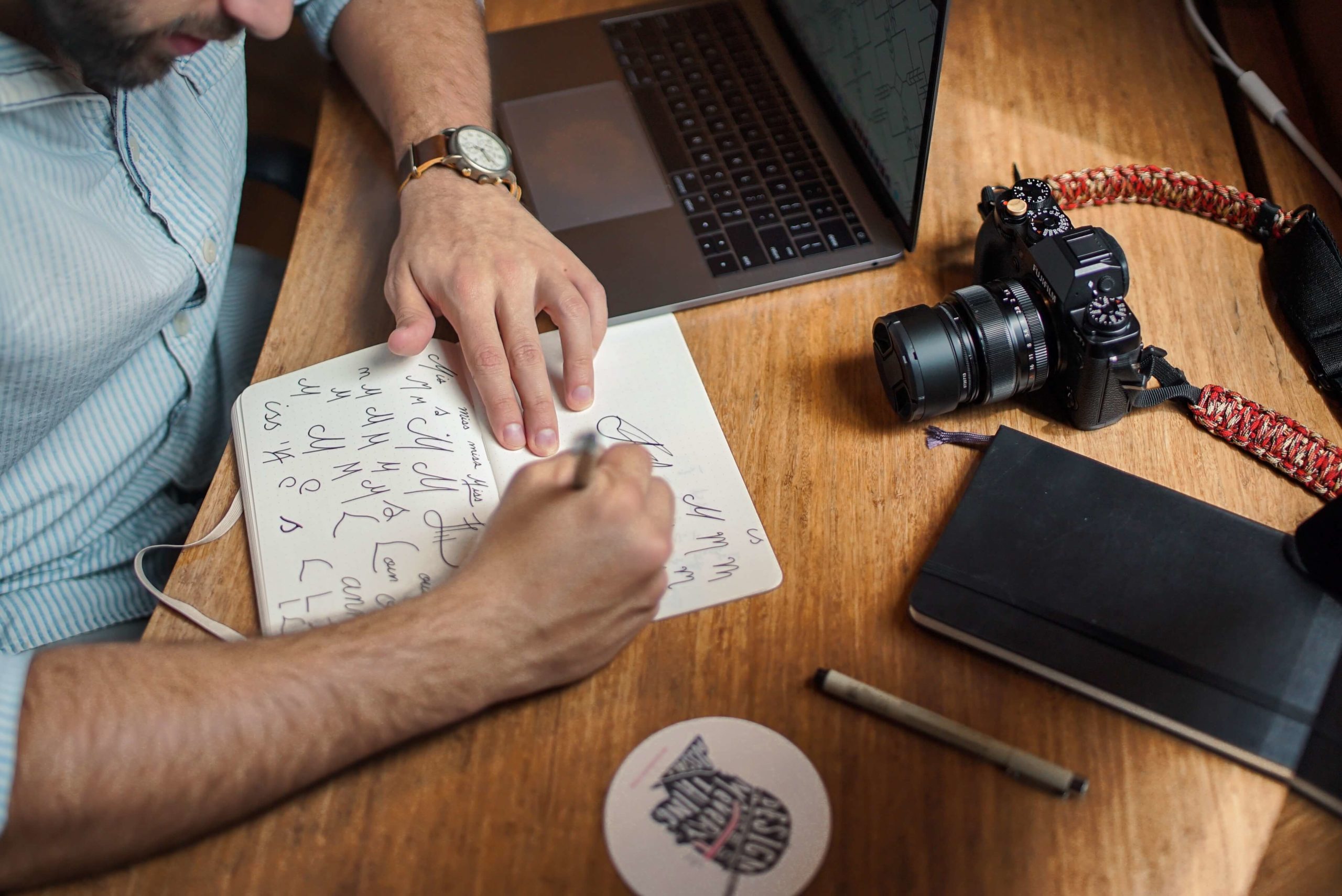
Photo by Brad Neathery on Unsplash


One Comment