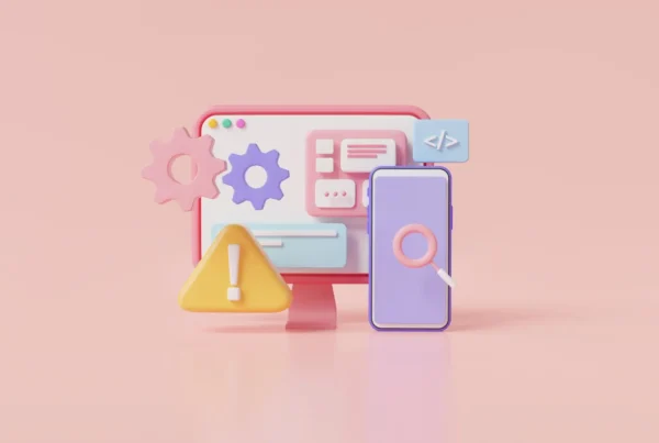


Back in 2016 Vox Media started The Accessibility Guidelines project, a list of how to make companies more responsible with their content regarding improved experiences for all people, including the ones with disabilities. The checkbox type of list includes 5 areas: designers, engineers, project managers, Q&A and editorial, all targeted to making content more inclusive and easily accessible.
But how to apply the Accessibility Guidelines to web design you might ask. Well, you will find my own list below, with explanations and examples of how we can make the web a friendlier place.
Here are 4 accessibility guidelines for web designers:
- Contrast between fonts and backgrounds
- Signaling important information
- Using explicative text for images, graphs and more
- Descriptive links
Contrast between fonts and backgrounds
In order to make written content clearly visible, make sure that the contrast between fonts and background is big enough. According to the WCAG, the contrast ratio between text and the text’s background should be at least 4.5 to 1. If your font is at least 24 px or 19 px bold, the minimum drops to 3 to 1 (though, worth noting that this is a little fuzzy because numbered sizes aren’t always reflective of the visual size type).
Due to the trends of 2020, be especially careful when fonts are over videos, animation or other colored backdrops.
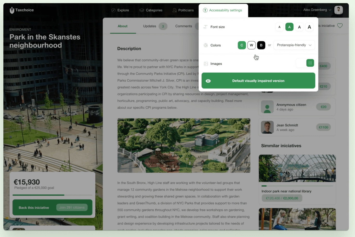
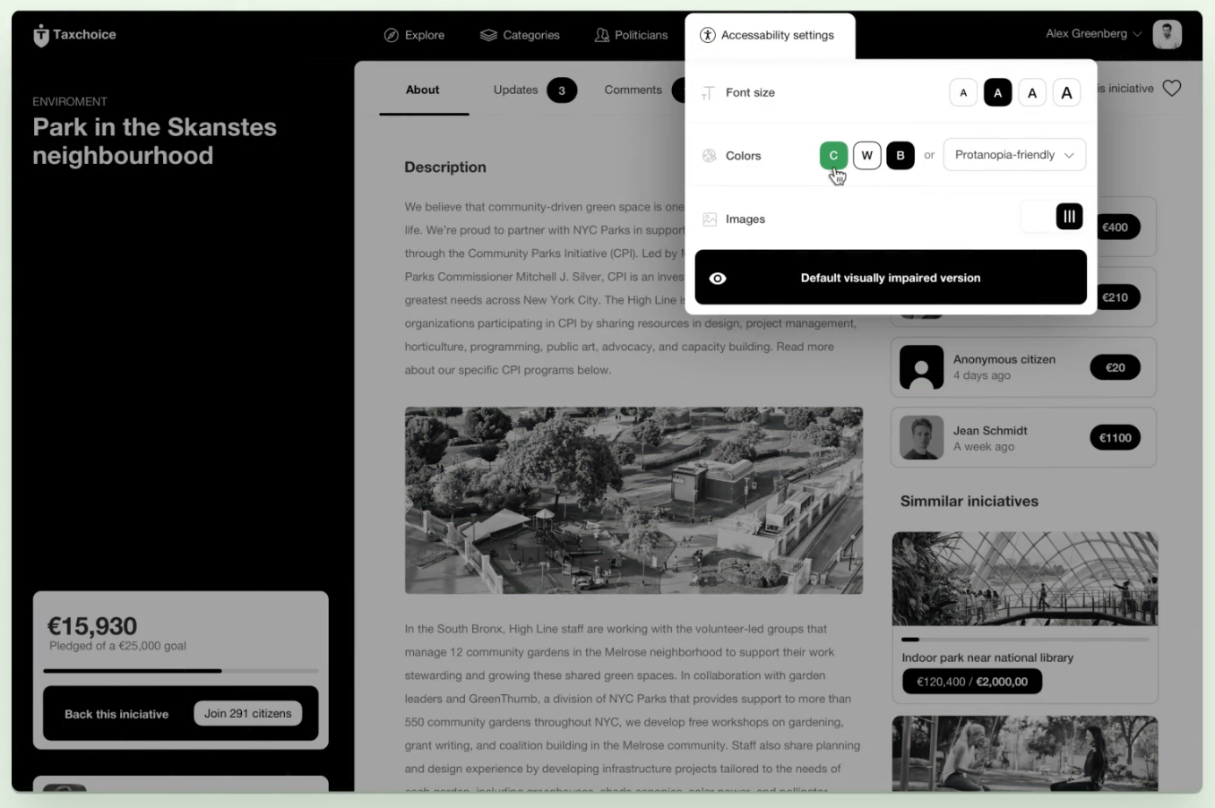
Signaling important information
When trying to make important information stand out, don’t rely on just colors. Use visual elements like icons or underlines to make the written content stand out. This will help people who can’t distinguish colors a lot!
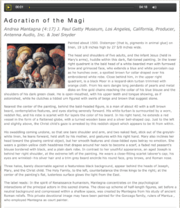
Using explicative text for images, graphs and more
When your page contains mostly images or videos, make sure to include written content to explain them.
Use alt text whenever applicable; this will help people who are visually impaired to understand your website better.
Descriptive links
When adding links into your written content or design elements (like buttons or call to action boxes) make sure the text on them is descriptive enough. Avoid expressions like “click here” or “link below” in order to give the user an idea of what they will find on the other side.
Conclusion
Just by implementing these simple 4 guidelines, your web design will be more accessible and the people who need will definitely appreciate it. You can read more about the Vox Accessibility guidelines on this link.
Now it’s your turn! Let me know in a comment what guidelines do you feel you need to implement on your website in order to make it more accessible.